Histogram · 直方图 / 频次分布#histogram#stats-box#three-panel#times-new-roman
PreRL · Three-panel gradient-metric histograms with stats box
PreRL · 三联梯度量直方图 + 统计信息框
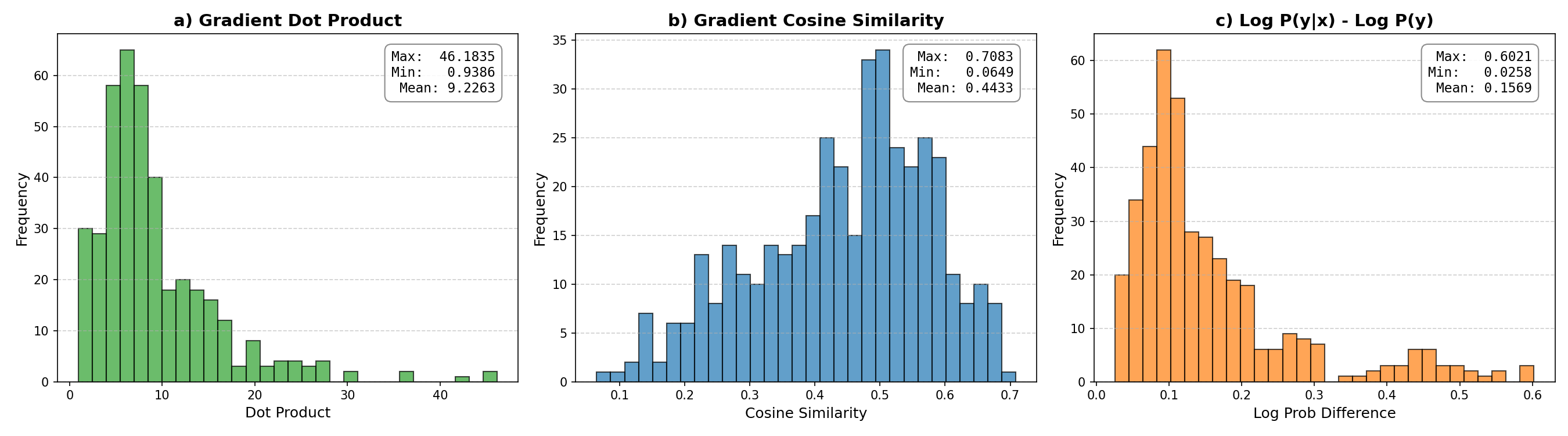
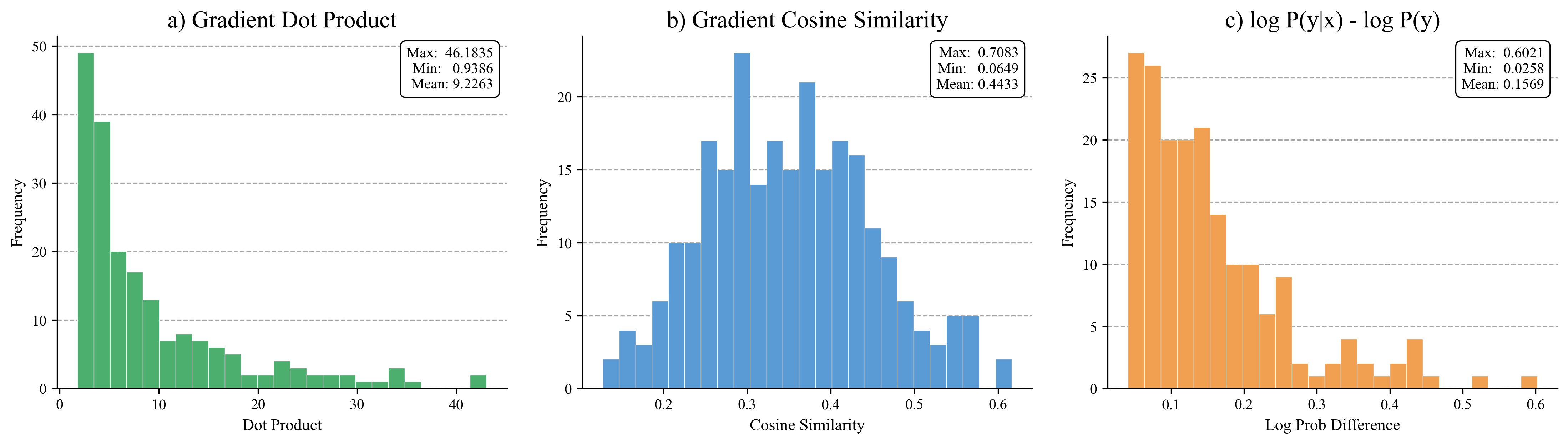
Three-panel histogram of gradient metrics: dot product (green, right-skewed), cosine similarity (blue, roughly normal), and log P(y|x) - log P(y) (orange, right-skewed). Each panel has a max/min/mean stats box pinned to the upper-right with a thin black rounded border, dashed y-grid, and Times New Roman titles.
三联直方图:点积(绿,右偏)、余弦相似度(蓝,近似正态)、log P(y|x) - log P(y)(橙,右偏)。每个子图右上角钉一个 max/min/mean 统计框(细黑圆角边框),y 轴虚线网格,Times New Roman 标题字体。
@paper · 来自论文
PreRL: Pre-train-Anchored Reinforcement Learning for Language Models
PreRL:预训练锚定的语言模型强化学习
PreRL Authors · arXiv 2026
// original from paper · 论文原图
// reproduced via prerl_grad_metrics_hist.py · 脚本复现download png
prerl_grad_metrics_hist.py
"""Three-panel histogram: gradient metrics distribution.

Reproduces the `grad_metrics_distribution` figure from the PreRL paper
(arXiv:2602.02488). Each panel shows the empirical distribution of one
gradient metric (Dot Product / Cosine Similarity / log P(y|x) - log P(y))
with a max/min/mean stats box pinned to the upper-right corner.

Standalone: just `python prerl_grad_metrics_hist.py`. Output PNG lands
next to the script. No external data files, no network calls.
"""

import numpy as np
import matplotlib.pyplot as plt
import matplotlib as mpl

mpl.rcParams['font.family'] = 'Times New Roman'

np.random.seed(42)

# ──────────────────────────────────────────────────────────────────────
# Synthetic data shaped to match the published per-panel statistics.
# (max/min/mean are quoted from the paper figure.)
# ──────────────────────────────────────────────────────────────────────

# (a) Gradient Dot Product: right-skewed, range ~0.94 - 46.2, mean ~9.23
dot = np.concatenate([
    np.random.exponential(scale=5, size=180),
    np.random.uniform(0.9, 3, size=50),
])
dot = dot[(dot >= 0.9) & (dot <= 46.2)]
dot = dot / dot.mean() * 9.2263
dot = np.clip(dot, 0.9386, 46.1835)

# (b) Gradient Cosine Similarity: roughly normal, range ~0.06 - 0.71, mean ~0.44
cos = np.random.beta(a=4, b=5, size=250) * (0.7083 - 0.0649) + 0.0649
cos = np.clip(cos, 0.0649, 0.7083)

# (c) Log Prob Difference: right-skewed, range ~0.03 - 0.60, mean ~0.16
logp = np.concatenate([
    np.random.exponential(scale=0.08, size=200),
    np.random.uniform(0.03, 0.15, size=40),
])
logp = logp[(logp >= 0.0258) & (logp <= 0.6021)]
logp = logp / logp.mean() * 0.1569
logp = np.clip(logp, 0.0258, 0.6021)

# ──────────────────────────────────────────────────────────────────────
# Plot
# ──────────────────────────────────────────────────────────────────────
fig, axes = plt.subplots(1, 3, figsize=(15, 4.5))


def plot_hist(ax, data, color, title, xlabel, stats, bins=25):
    ax.hist(data, bins=bins, color=color, edgecolor='white', linewidth=0.3)
    ax.set_title(title, fontweight='normal', fontsize=16)
    ax.set_xlabel(xlabel, fontsize=11)
    ax.set_ylabel('Frequency', fontsize=11)
    ax.tick_params(labelsize=10)
    ax.yaxis.grid(True, linestyle='--', alpha=0.7, color='gray')
    ax.set_axisbelow(True)
    ax.spines['top'].set_visible(False)
    ax.spines['right'].set_visible(False)
    stat_text = (
        f"Max:  {stats['max']:.4f}\n"
        f"Min:   {stats['min']:.4f}\n"
        f"Mean: {stats['mean']:.4f}"
    )
    ax.text(
        0.97, 0.97, stat_text, transform=ax.transAxes,
        verticalalignment='top', horizontalalignment='right', fontsize=10,
        bbox=dict(boxstyle='round,pad=0.4', facecolor='white',
                  edgecolor='black', linewidth=0.8),
    )


plot_hist(
    axes[0], dot, '#4caf6e',
    'a) Gradient Dot Product', 'Dot Product',
    {'max': 46.1835, 'min': 0.9386, 'mean': 9.2263}, bins=25,
)
plot_hist(
    axes[1], cos, '#5b9bd5',
    'b) Gradient Cosine Similarity', 'Cosine Similarity',
    {'max': 0.7083, 'min': 0.0649, 'mean': 0.4433}, bins=25,
)
plot_hist(
    axes[2], logp, '#f0a050',
    'c) log P(y|x) - log P(y)', 'Log Prob Difference',
    {'max': 0.6021, 'min': 0.0258, 'mean': 0.1569}, bins=25,
)

plt.tight_layout(pad=2.0)
plt.savefig('grad_metrics_distribution.png', dpi=300, bbox_inches='tight')
print('Saved grad_metrics_distribution.png')